Changing space and working style: A case study from CHOP Roberts Center for Pediatric Research
(Slides courtesy of Doug E. Carney of CHOP.)
The Mid-Atlantic Hospital, Outpatient Facilities & Medical Office Buildings Summit was held June 20 in Philadelphia. More than 100 FMs, architects, designers and real estate professionals gathered to learn from 22 speakers about trends in the healthcare facilities market and examine real estate case studies from major healthcare players like the Children’s Hospital of Philadelphia and Thomas Jefferson University. The McMorrow Reports covered the conference and will be sharing summaries of some of the sessions.
Doug E. Carney, Senior Vice President for Facilities, Real Estate and Capital Program, of Children’s Hospital of Philadelphia, and Terry D. Steelman of Ballinger, shared their journey to move the Children’s Hospital of Philadelphia’s Roberts Center for Pediatric Research to new space and a new way to work.
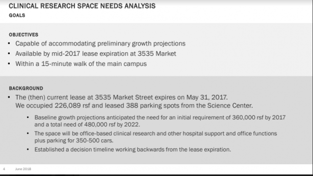
The (then) current lease at 3535 Market Street expired on May 31, 2017. (See slide.) They occupied 226,089 rentable square feet and leased 388 parking spots from the Science Center. Baseline growth projections anticipated the need for an initial requirement of 360,000 rentable square feet by 2017 and a total need of 480,000 rentable square feet by 2022. The space will be office-based clinical research and other hospital support and office functions plus parking for 350-500 cars.
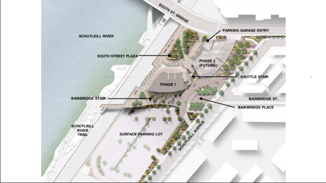
CHOP decided on a 21-story tower along the Schuylkill River in Philadelphia. The tower, designed by Ballinger and Pelli Clarke Pelli, is the first of four buildings in CHOP’s master plan for the 8.4-acre site. (See slide.) The tower officially opened at the end of May 2017.
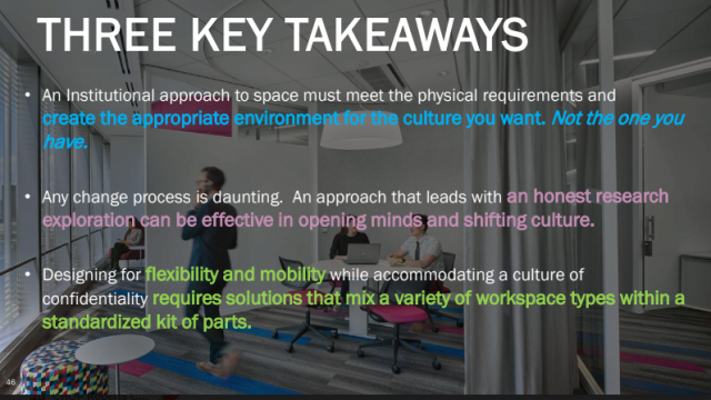
Carney explained that the existing space on Market Street was state of the art in 1974, and the teams were still working that way. The scientists connected their offices with the higher education degrees they earned. They felt the walls and the amount of space was symbolic of their Ph.Ds and were reluctant to give them up. They also greatly valued privacy for their research.
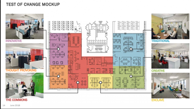
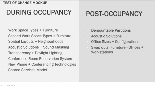
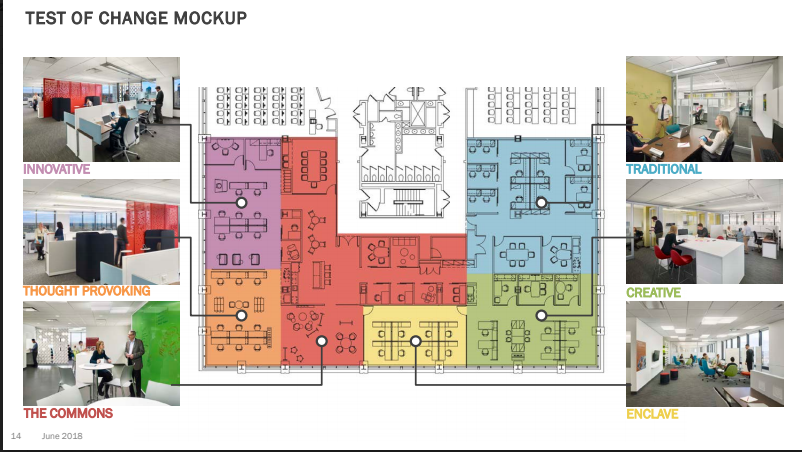
Carney and Steelman were able to create a test of change mock-up space with six styles of office: Innovative, Thought provoking, The commons, Traditional, Creative and Enclave. (See slide.) The business units were allowed to choose the space they wanted, but they had to stay in it. They were also given new technology in the space so they were working differently not just in different desks. They did NOT place groups where they wanted them or thought they would do best. They didn’t want to sway the results.
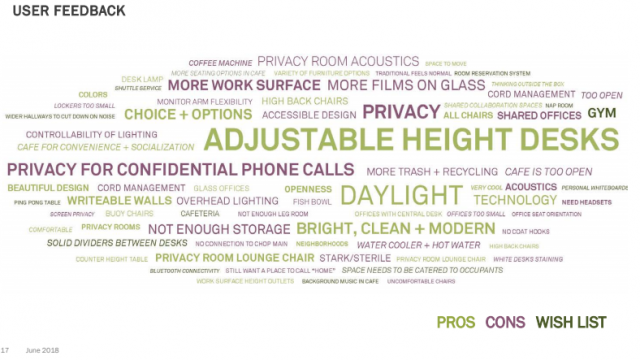
During the test, the team was constantly observing and surveying the occupants with formal polls, as well as a question-of-the-day on a writable wall near the coffee station. The team also cross-referenced what the groups self-reported to see if it was true — such as amount of time spent in the office. Time spent in the office determined where you were placed in the space, i.e., access to light, getting an office or even the investment of a sit-stand desk. The only complaints they get are from people who didn’t participate in the mock up.

